RevBoss
- Branding
- Illustration
- UI/UX
Refreshing a brand with an updated design toolkit.
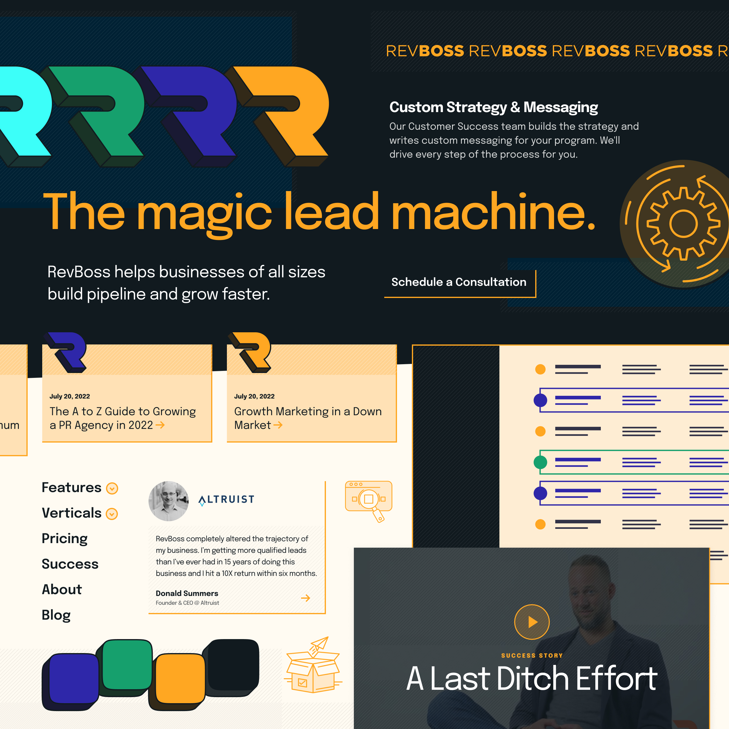
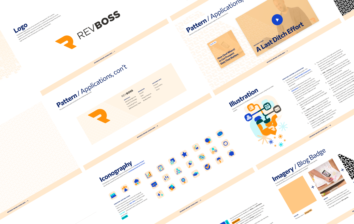
RevBoss is a marketing consultant that creates robust audiences and sales pipelines. They were working with an old, boilerplate WordPress theme and not much more than a logo and the color orange for their brand identity.
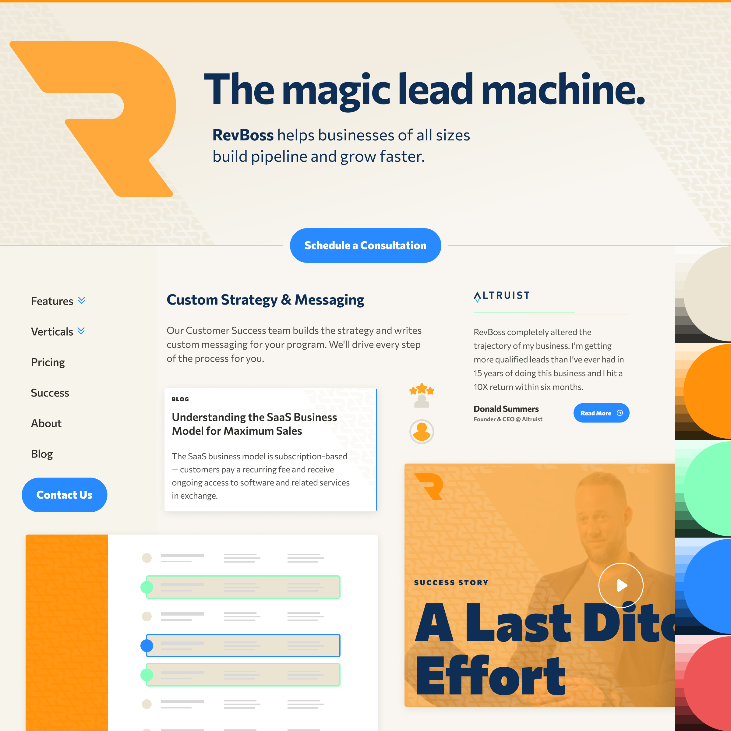
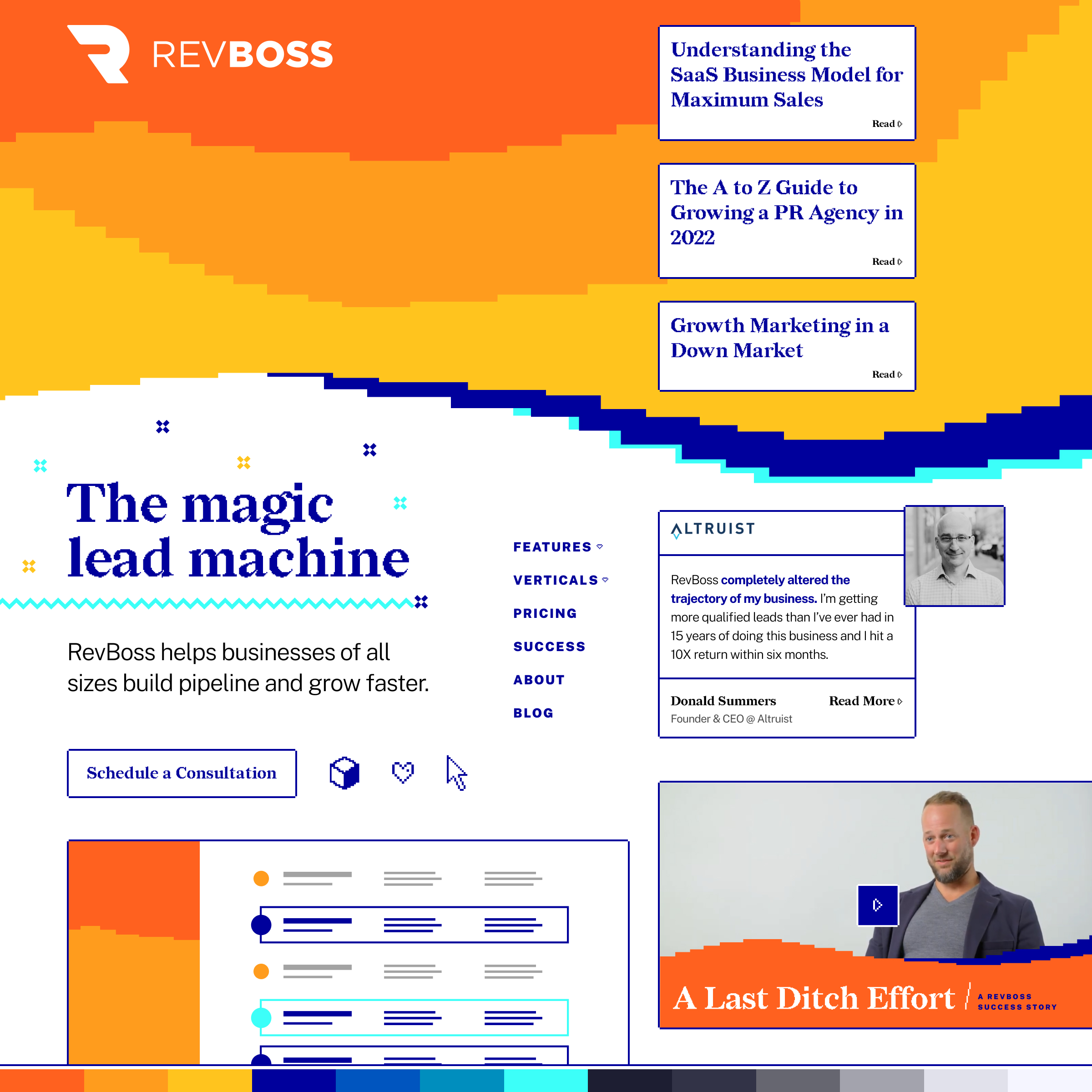
Through discovery workshops and spectrum polling exercises, I identified the important design traits with the opportunity to set RevBoss apart in its industry.
- from illustrative to minimal brand graphics
- from a fun to a serious attitude
- from an image-heavy to a type-heavy style
- from a personable to a corporate mindset
With the RevBoss team, I gauged their current position on those axes as well as where their refreshed brand should be. Using that workshop, I created three unique brand refresh directions and expanded the chosen direction into a set of defined brand guidelines and design compositions. To further expand their brand toolkit, I created a Figma document with illustration tiles for RevBoss to use to create bespoke brand imagery and reduce reliance on stock photography.
Design exploration
New design system elements
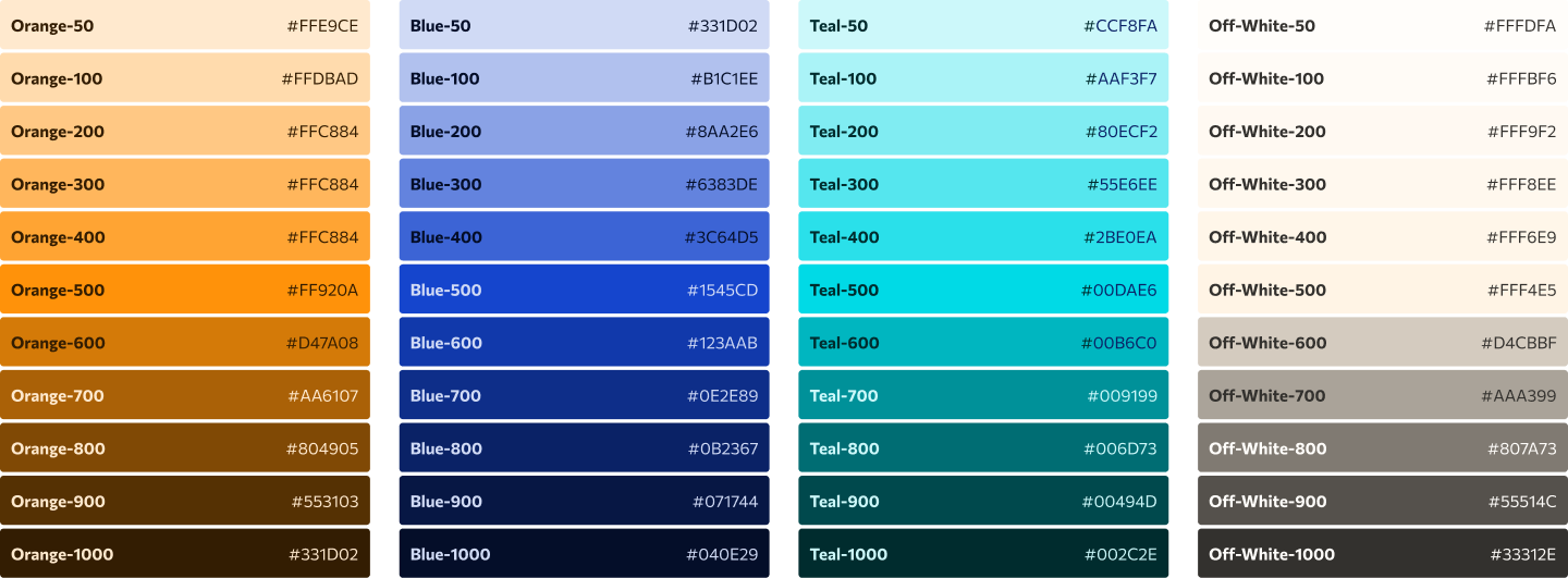


I want to talk about colors with you.

Design is for people.
©2025 Drew Glover. All work created by me unless specifically stated. No AI assistance used in any work on this site.
Built with WordPress, Semplice, and Figma. Typography used: MD Nichrome and AT Name Sans.
