Thresher
- UI/UX
Redesigning to demonstrate the full capabilities of a SaaS tool.
Thresher had a solid user base built through word of mouth, but lacked a strong web presence and was having trouble fully demonstrating the capabilities of their product to potential new users.
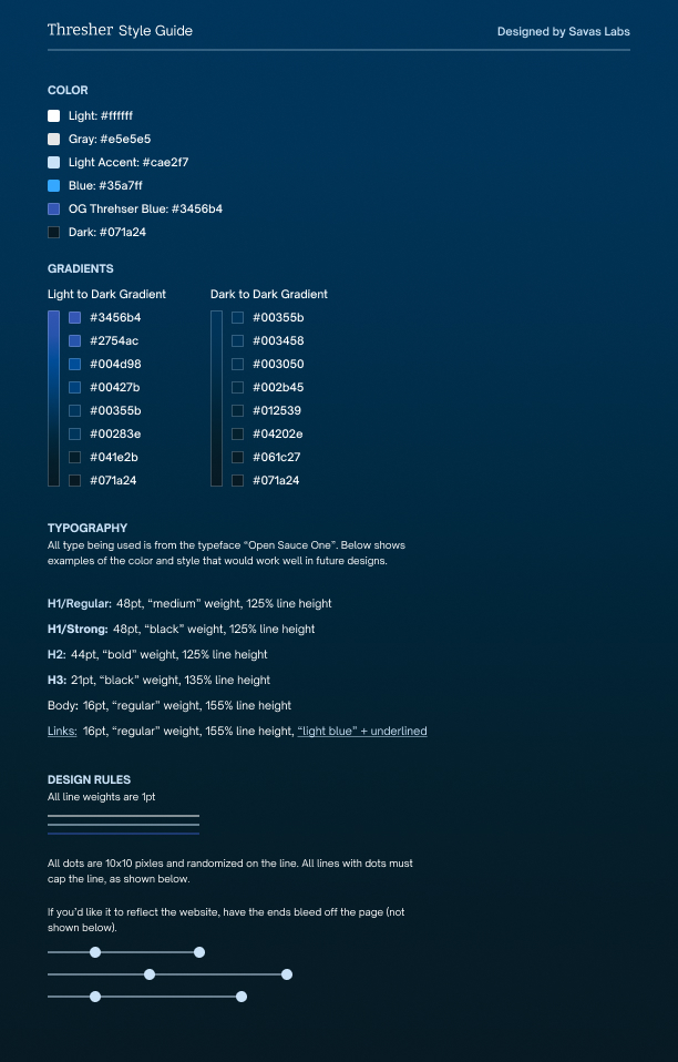
They had a logo, but no other rigid brand identifiers. Using their trademark thresher shark iconography, I created a straightforward design system of type and color to apply across their public-facing marketing site and data analysis tool. The redefined look, consisting of dark blue and black gradients, gave them a point of view and consistency across their brand touchpoints.
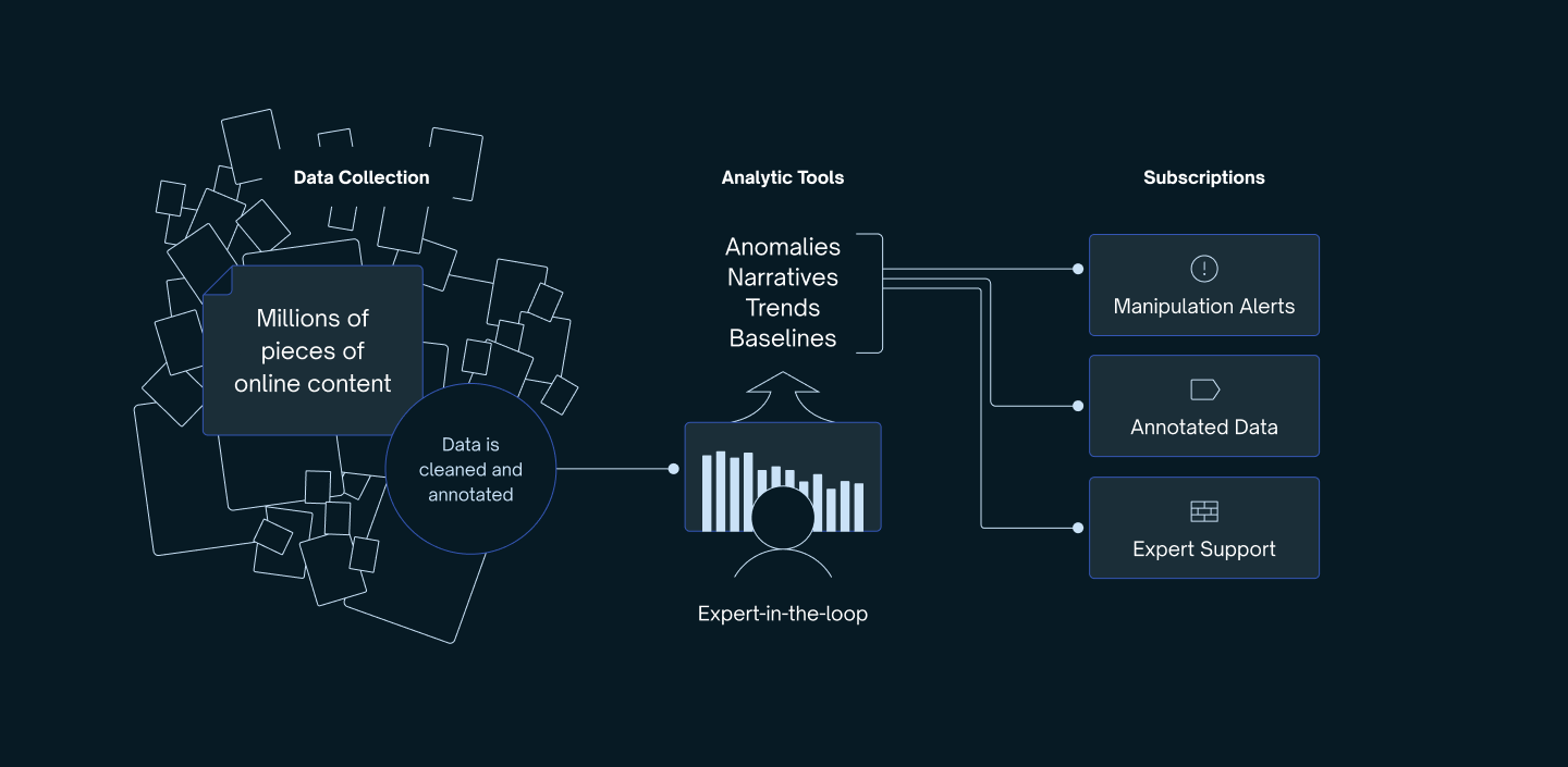
In addition to the overall look and feel, I created several spot illustrations used as backgrounds for screenshots or to demonstrate a process.
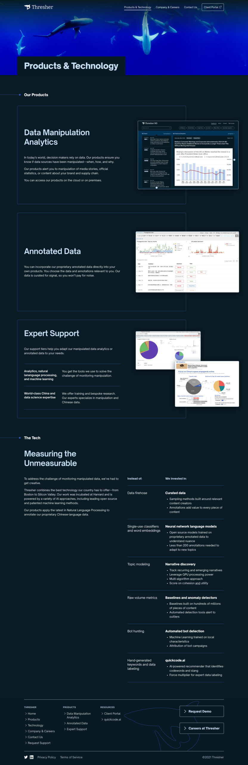
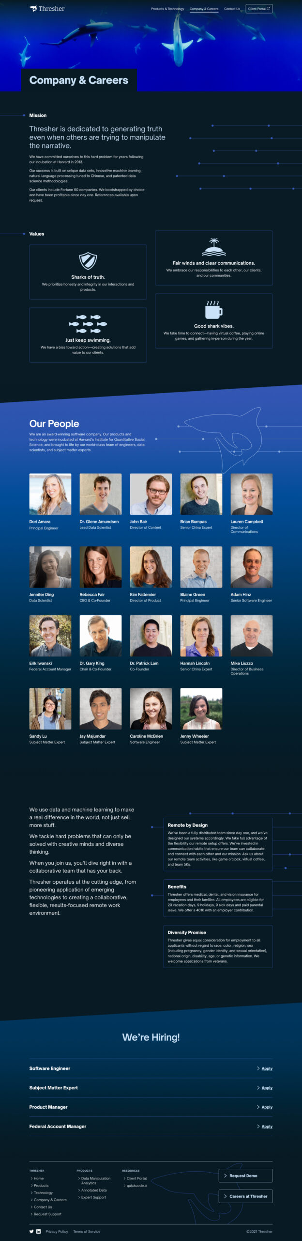
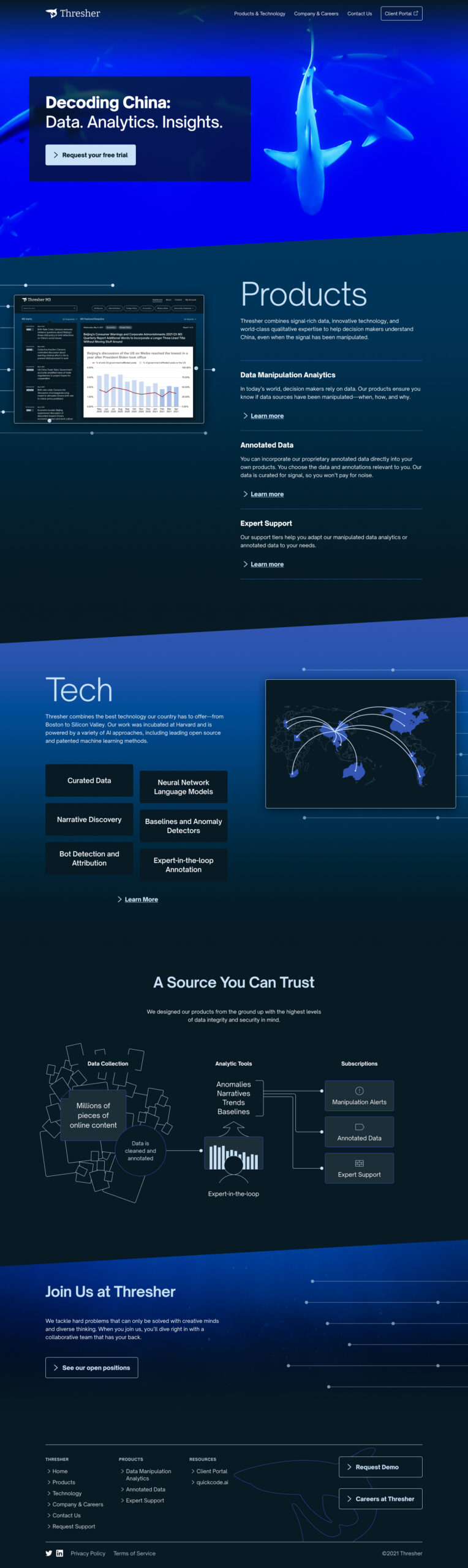
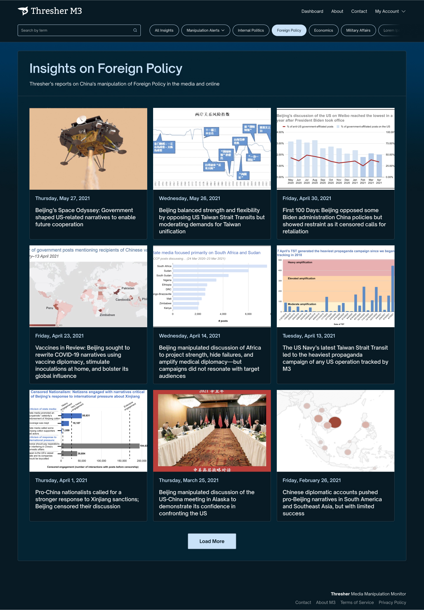
New page templates for Thresher marketing site
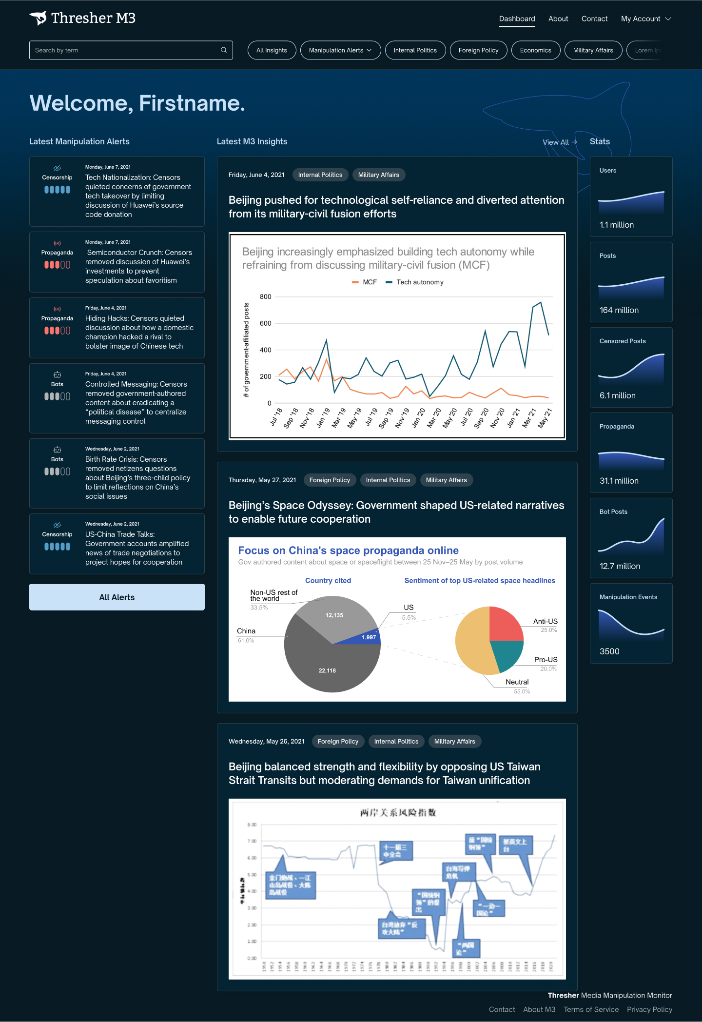
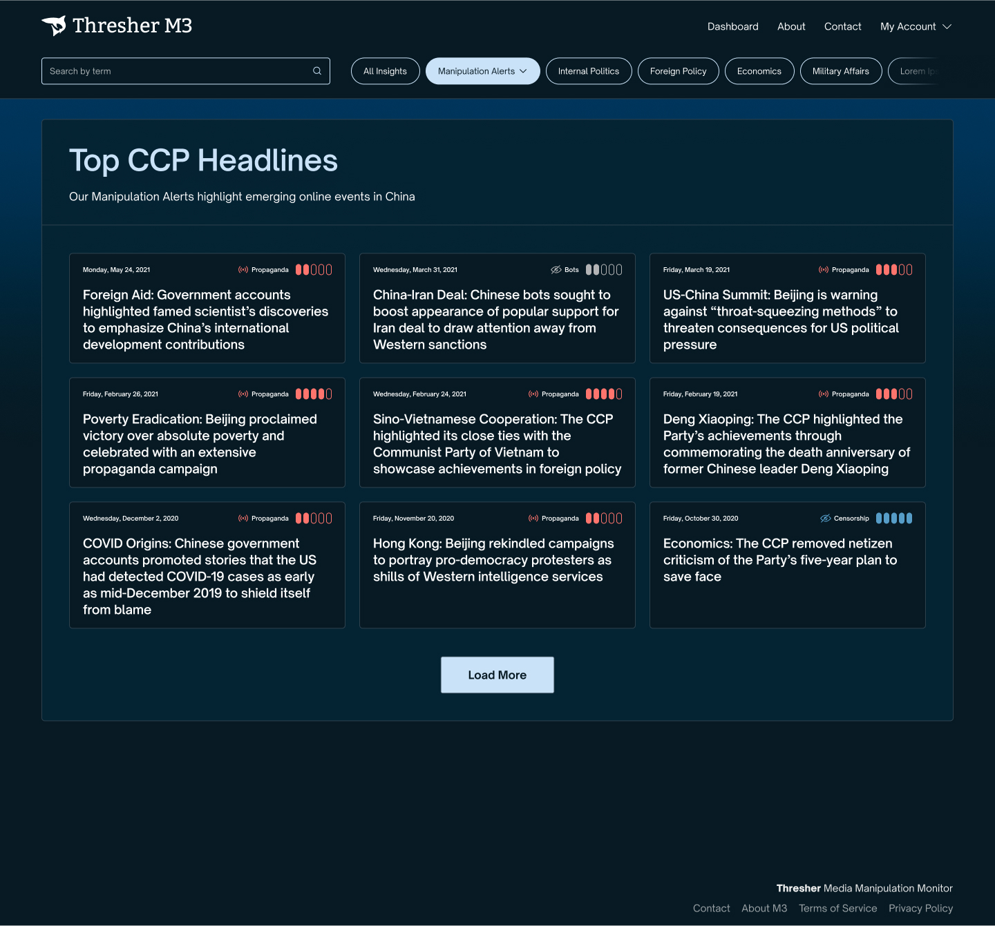
New designs for data monitoring dashboard
Style guide and custom illustration
I want to talk about colors with you.

Design is for people.
©2025 Drew Glover. All work created by me unless specifically stated. No AI assistance used in any work on this site.
Built with WordPress, Semplice, and Figma. Typography used: MD Nichrome and AT Name Sans.
