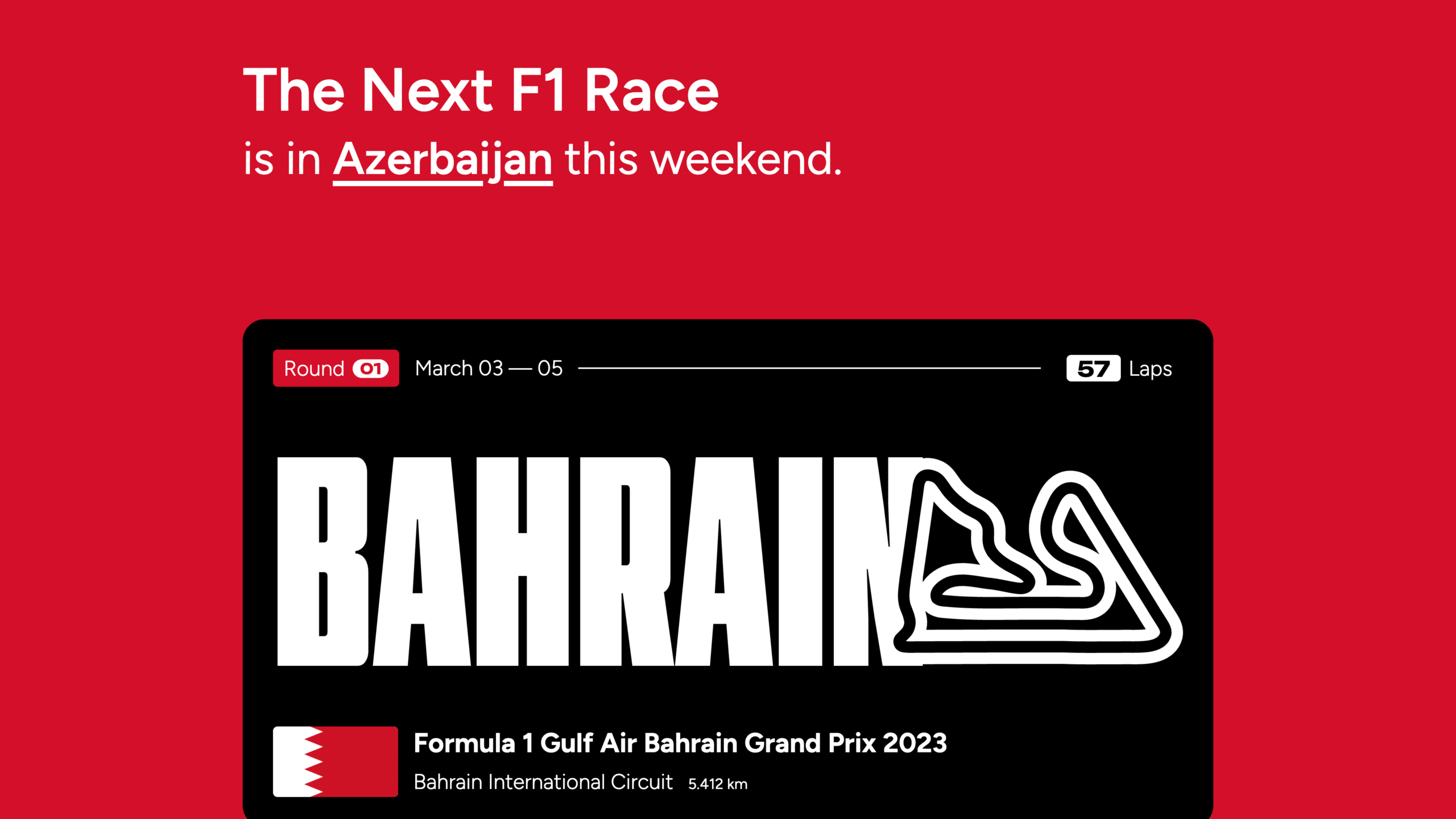
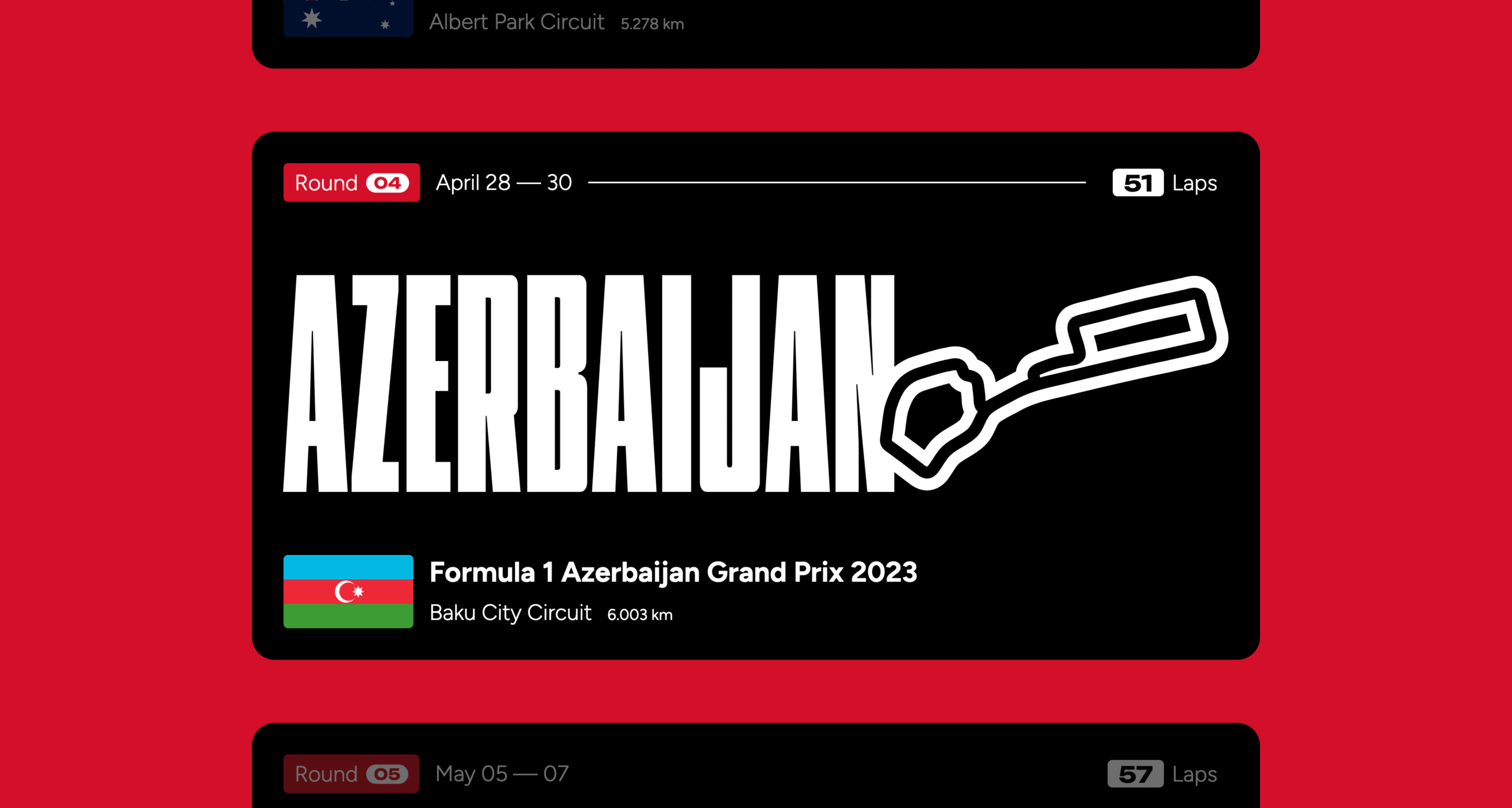
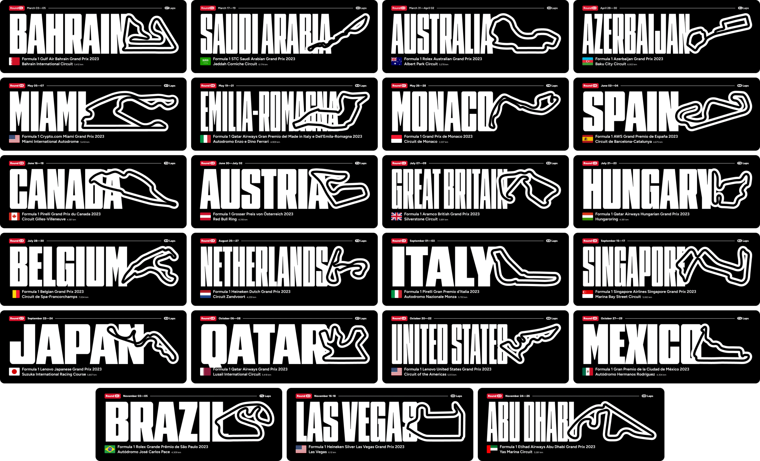
The Next F1 Race
- UI/UX
Creating a design-led display of the annual Formula 1 racing calendar.
This project was featured on fontsinuse.com.
When I encounter regimented information, such as a sports team's season, an annual rivalry match, or a season schedule, a thought I often have is "what if this, but different?" That thought, combined with the newly released variable fonts from David Jonathan Ross' Font of the Month Club, resulted in this design exercise turned microsite.
Location names are a great dataset to use for testing new fonts and combinations of letters. As I was exploring the latest version of Nickel Gothic, I copied in the F1 Grand Prix locations to see how capable the font was on its width axis to make every location the same width.
After demoing the exploration to my colleague Lemon, we began ideating ways the design could graduate from something static to something interactive. With the aid of some rapid prototyping from Lemon, we landed on the animation of the width axis and connected it to the scroll action.
The result is the same information, but different: a distinctly typographic approach to the Formula 1 season.
I want to talk about colors with you.

Design is for people.
©2025 Drew Glover. All work created by me unless specifically stated. No AI assistance used in any work on this site.
Built with WordPress, Semplice, and Figma. Typography used: MD Nichrome and AT Name Sans.
